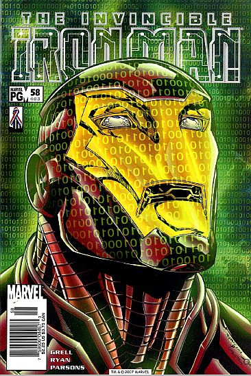
IRON MAN vol. 3 #58 (403)
(Oct. 2002) "Sympathy for the Devil, part three."
Cover art: Michael Ryan.
Script: Mike Grell.
Art: Michael Ryan/Sean Parsons.
Ho-hum. Tony Stark/Iron Man battles Ty Stone in DreamVision....again. We just saw this -- what, almost 20 issues ago? After easily rescuing Rumiko, Tony sends her off on "a mission" -- to convince city authorities to shut down the power to the entire grid serving Ty's virtual reality system. She succeeds, and Ty is last seen walking around in pitch blackness. My opinions on the art really hasn't changed, although Ryan/Parsons' Iron Man is sure sweet! Kudos to 4 of the 5 letter writers in this ish -- they are A.I. contributors!
Hube's Recommendation: 2 1/2 repulsors!
Fan Reaction: Hube, I disagree with your rating of IM #58. I thought it was a great issue! The artwork was credible...everything from Ty Stone's demented kingdom in Dreamvision to Iron Man himself! Agreeably, the story didn't utilize Tony's noggin' all too much, but in comparison to the past 7 issues (where Tony's solution has been to punch, repulsor or unibeam a problem), in this issue he thinks out a very logical way to shut Stone down. This issue is at least worthy of 3 and a half repulsors, if not 4 for just being a REAL victory for Stark. (And, you've got to admit, the art HAS improved; Parsons does a pretty darn good job in this issue, and Ryan has improved as well as far as facial anatomy is concerned.) -- hyper_aj00@yahoo.com
Fan Reaction 2: Hube, I have to agree with you and disagree with the the letter writer (above). It's not that the issue was bad, but it's been done before. Just a re-hash of the last Ty story with a corny end (this great genius didn't think about the possibility of a blackout, losing power and NOT have a backup plan?). As for the art, to each his own. I like my Iron Man clean, slick and clear. Ryans stuff is too messy and as a story teller he's difficult to read. -- Shawn
Fan Reaction 3: Hube, i preferred the black+white original take of this story -- it was shorter. I gotta say I'm heartbroken at the state of IM since Sean Chen and Busiek left the scene, sales over this period must have hit freefall. I've witnessed bloated manga forms, uninspired stories and ugly unsleek armor designs. I look at a recent IM issue and compare it to any issue vol. 3 1-30 and see the vast decline in creative ability. Huge chunks of continuity formed over the last few years need to be ripped out and destroyed not least the revealing of Stark as IM. And let's have a campaign to bring back the beautiful Heroes Return armor or the classic armor with modifications with a great artist to render and an enthusiastic creative writer to scribe. --

