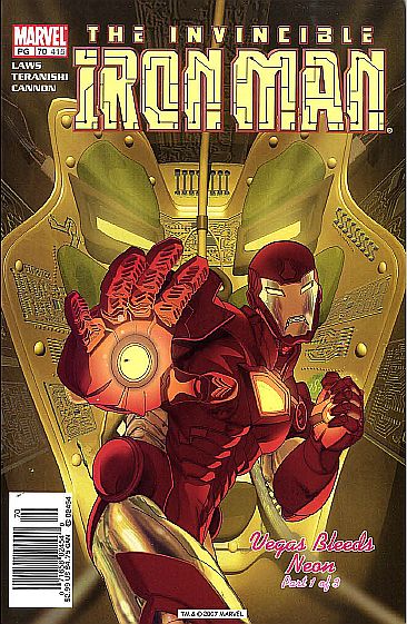
IRON MAN vol. 3 #70 (415)

(Sept. 2003) "Vegas Bleeds Neon" part one.
Cover art: Feister & Harris.
Script: Robin Laws.
Art: Robert Teranishi/Eric Cannon.
As Tony Stark ponders how to untarnish his company's reputation from the "Manhunt" saga, he receives an interesting phone call from a Ms. Saige Kaufman -- regarding a mysterious blueprint from the late Howard Hughes -- and a missing person by the name of Mo Stanton! Tony agrees to meet Saige in Las Vegas to see what's up. There, Tone agrees to play a "victim" (like Stanton was, apparently) at the local baccarat tables. It plays out as planned, but Tone and Saige learn nothing. Later, after Tony checks out his hotel room with special "security" binoculars, he falls asleep...but suddenly a mysterious flowing substance oozes from the room's thermostat...into the Iron Man armor!! It looks much like Chuck Austen's Darkhawk from vol.1 US War Machine once it's assembled, and it begins pummeling Stark all over the room! Tony notices that the creature "bleeds and feels pain" -- right before the thing clutches Stark by the throat!
The story is a bit too slow in spots, but Laws' narratives and dialogue flow nicely. He seems to have a very nice grasp on the character of Tony Stark, and he injects just the right amount of humor, including a priceless panel where Tony imagines his Iron Man armor with '57 Thunderbird styling! Teranishi's art is nice -- very much like the Avengers' Olivier Coipel's and Gary Frank's style.
Hube's Recommendation: 3 repulsors!
Fan Reaction: Dear Hube: I really enjoy your reviews and find them spot on. I agree with your review of issue 70. I believe we are seeing the rebuilding of the quality of the magazine. I am sure it is difficult to keep the quality up on all of Marvel’s projects at the same time. I am glad to see Marvel is finally giving this magazine the creators it deserves. I hope the trend continues.
I liken the Iron Man situation to what we have seen on the Hulk. Like Iron Man the Hulk had some poor creative decisions with the reboot. However, attention to the magazine has resulted in steady improvement and the readership has increased dramatically. I believe the same will be true for Iron Man. One minor point. When I go through your repulsor ratings I see that you have given some “okay” issues the three repulsors under Grell’s run. I believe that when you go back and compare “Vegas bleeds Neon” by Laws with “You can’t always get….” By Grell there should be some ratings differential. I believe your ratings on Grell were increased because you were enthused about any positive direction on the title. Would you consider going back and changing the ratings on “You Can’t Always Get” to a 2 or 2 ½? -- Robert Samuel
Fan Reaction 2: Yeh not a bad issue. I liked the art, tho too many famous faces popped up (Sean Connery, Tony Hopkins, Vinnie Jones etc.) which shouts look at how good I am at likeness'! Story was plodding in parts but let's hope this green slime destroys armour forcing Tony to finally redesign the wretched thing -- or are we forced to continue with it 'cos of design tie-in with upcoming film?!?!! Let us hope not. --fictionfact1@yahoo.co.uk

